Design principles
|
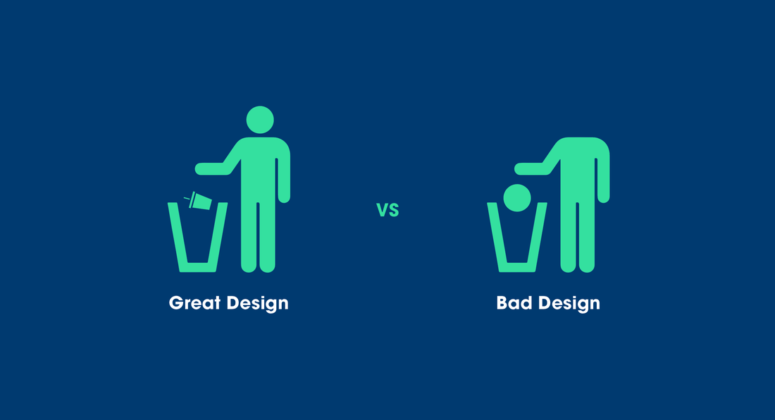
While creating any “product” for a course, the design should be part of the core of your message. Information needs to be transmitted to the student in a meaningful manner for students to learn. Here are a few things to consider when creating content.
|
typography
|
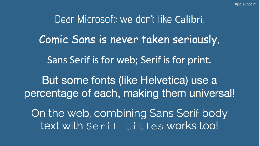
While some software comes with default fonts, which is most often Times New Roman, you don’t have to conform! Keep your font choice in mind so your content looks original, creative, and is suitable for its web-based medium or printed materials. |

|
Space and order

|
Basic Rules:
|
Color
|
Recommendations:
Color can be tricky. Black text on white or white text on black is not always the most visually appealing. Your color theme should complement your topic. In order to reach a color balance, you should use one dominant color. One support color, and one accent color. Need help picking a color! Visit Coolors.com a very easy to use color scheme generator. |
|
design checklist
Is the typography arranged as a hierarchy of importance? is it legible and readable?
Are elements arranged in a way that is not distracting but informative?
Are you using no more than 2 fonts?
Do you have 1 dominant, 1 support & 1 accent color?
Are the colors easy to digest and are they comforting to the viewer?
Over all else, ask for someone else to see the design before made public

|

|
can i use this?
|

Public Domain: Many assets exist as Public Domain, meaning they are no longer copyrighted and can be used freely. Many Public Domain assets can be found at the Library of Congress and the National Archives.
Additionally, people who support Creative Commons can choose to unlicense their creations as CC0 which removes their right to copyright. These are also considered Public Domain.
Creative Commons: Licensing is an easy solution for using assets, such as images, without having to track down the copyright holder and acquire written permission every time you need to use something.
CC BY: All Creative Commons licenses require you to attribute the creator. This is the Name or Username of the person, organization, entity, etc.
CC BY-SA: Creative Commons has a Share-Alike license which allows you to use the asset as long as you also distribute it with a Creative Commons by-Share Alike license.
CC BY-ND: Creative Commons by-No Derivatives means you cannot modify, remix, alter, change, etc. the asset if you desire to use it. If you need to make changes to an asset, choose an asset with a CC BY or CC BY-SA license instead.
CC BY-NC: Creative Commons by-Non-Commercial means you cannot use the asset for any kind of commercial activity. This is the trickiest of all Creative Commons licenses. If you cannot 100% without a doubt make a solid argument that your use is non-commercial, it is best (and safest) to use something with a different, less restrictive Creative Commons license.
For more information please visit Creative Commons.org
Keep in mind: Accessibility
Multimedia accessibility can be explained as the delivery of the information, intent and content presented in videos and audio immaterial of user’s disability. The core areas of multimedia accessibility are – synchronized captions, text transcripts and audio descriptions.
When searching for multimedia in your course try to find content with the following accessibility features. If these features are not available consider creating some of them.
Multimedia is about making creative and effective use of online technology. By putting these and other digital accessibility solutions into place, your multimedia can be as engaging to people with disabilities as you intend it to be for everyone.
For more information on accessibility please visit the Web Content Accessibility Guidelines.
When searching for multimedia in your course try to find content with the following accessibility features. If these features are not available consider creating some of them.
- Captioning
- Use it for: videos, animations
- Who it helps: Captioning allows people who are deaf or have hearing loss to understand what is being said or heard in the video.
- Bonus: Captioning makes a video more understandable for people who don’t speak English fluently. It also displays the spelling of unfamiliar words, such as medical or scientific terms.
- Audio Description
- Use it for: videos, animations
- Who it helps: Audio description allows people who are blind or have low vision to understand what’s happening in the video when the regular soundtrack doesn’t provide enough information. It can also help people with autism who have difficulty interpreting visual information like facial expressions.
- Bonus: Audio description allows people to watch a video while they’re multitasking, with their eyes somewhere else.
- Transcript
- Use it for: videos, animations, audio
- Who it helps: Transcripts allow people with hearing disabilities to understand audio information. It’s also an alternative for people with other kinds of disabilities, such as those who are blind and use screen readers (a type of assistive technology that reads out loud all the text on a screen).
- Bonus: Transcripts are useful for anyone who wishes to search for something specific without taking the time to watch the entire video or listen to the whole audio clip. A transcript can be linked, so that the user is able to click any point in the transcript and go directly to that point in the video or audio. Transcripts also help people who don’t have the bandwidth available to watch a video.
- Alternative Text
- Use it for: photos, infographics, diagrams, charts
- Who it helps: Alt-text means that people who have vision disabilities and use screen readers will be able to understand what’s displayed on their computer screen.
- Bonus: Alt-text, when applied accurately, allows search engines to index the image properly. This means that anyone, with and without disabilities, will be more likely to encounter your website when they’re conducting a related search.
Multimedia is about making creative and effective use of online technology. By putting these and other digital accessibility solutions into place, your multimedia can be as engaging to people with disabilities as you intend it to be for everyone.
For more information on accessibility please visit the Web Content Accessibility Guidelines.
